We’re Alludo now, but as you know, the name “Corel” has been around for a long time. If it were a person, it’d be starting to wake up with back pain and needing to squint to see the clock on the microwave. (Okay, it’s only 35…but as someone on the other side of 35, I get to make that joke.)
That’s not a bad thing, with age comes experience and Alludo has a rich history with a ton of name recognition. With such an extraordinary legacy, why engage in a total, back-to-the-drawing-board rebrand? It’s not because we’re not proud of where Alludo has been. In fact, it’s the opposite. We are so proud of where we’ve been that we want to honor that legacy and do it justice by ensuring that it can make an even bigger impact going forward.
The company—and the world of knowledge work as a whole—is at a major inflection point. We’re not just immersed in the future of work; we’re actively building it. That’s a huge role to take on, and as we reimagine what work feels like, we knew it was the right time to reimagine what our brand feels like, and the purpose it serves in the world.
I love branding; it’s my favorite part of the job and it absolutely never gets old. It’s what lights a fire in me and ignites my passion, but it’s also a monumental undertaking with huge stakes (and lots of opinions).
I wanted to take this opportunity to walk you through a bit of our thought process and route to where we are today. It was a methodical and mess process that brought us our new brand, Alludo.
The why
To take on a rebrand of this magnitude, first, you have to figure out the why. You need a rock-solid reason behind a herculean effort like this one—especially when you’re shaking up an established brand like we did. Here are a few reasons you might rebrand. Any or all of these might apply:
- Name change. You underwent M&A, have a bad reputation, or you have a name that doesn’t represent the full picture of who you are.
- Evolution. The old identity no longer represents what the company stands for.
- Inconsistency. There’s no integrated system and/or an inconsistent presentation of parent brand and sub-brands.
- Confusion. Lack of understanding surrounding your vision, story, or even your product portfolio.
- Relevance. Stale or old-fashioned brands need to find relevance in a new world.
- Growth. Growth that changes your audience and what you want to say.
- Innovation, momentum, and the future. A signal to the market that you have a new vision and purpose, and are building what’s next.
For us, most (if not all) of these applied to our brand. Again, not a bad thing, but an indicator that it was time for an evolution.
A strategic platform
After starting with our why, we moved toward establishing a strategic platform that would anchor our rebrand and give us structure to align everything to moving forward.
Overall, our new strategic platform is about giving space to work and time for ideas. Here’s how we drilled down to simplify who we are:
Why are we here (our purpose)? We believe freedom leads to more moments of genius.
What’s our commitment? To give everyone the space to take more ideas forward.
What do we do? Our software liberates people and organizations from everyday constraints to reimagine where, when, and how we work.
How do we do it? We remove barriers, stretch space, bend time, and go beyond.
What’s our attitude? An unrestrained spirit, alive with ingenuity.
Our beliefs
Next, we established our core beliefs. These are like values, but more action-oriented and specific. They guide how we show up every day (as a brand and as employees) and how we deliver on our strategic platform. (Check out more on these beliefs here.) These beliefs are fundamental to our brand and necessary to know and understand before we can develop any part of our new brand identity.
When you engage in a rebrand, particularly a name change, that name change gets all the headlines. But we nailed down our strategic platform and beliefs before we even seriously started thinking about a name or color scheme. Why? Because our brand identity, name and all, should reflect who we are, not the other way around.
Naming
If you’ve gone through a naming process, you know how convoluted (and exhausting!) it can be. We tossed around several hundred names—maybe thousands, literally. We did a high-level vetting of hundreds. Through legal, internal and external counsel, we did a deep dive on dozens. We voted. We researched. We voted again. We threw out our top contenders and started over (really). We kept iterating until we finally found something that was authentic to us. It was a long and sometimes painful process. Naming is a team sport and none of us came out of the process entirely unscathed.
In the end, it was Alludo. A name that actually came from the internal team and though we had an amazing agency working with us every step of the way (and literally around the clock for weeks) to share ideas, our final choice is as authentic as it comes because it came from one of us.
Now we can proudly say that we’re Alludo, and we empower all you do.
Our identity
Long before we finalized the name, we began working on our brand identity. We considered typography, color pallets, photography styles, and overall aesthetic. We agonized over myriad shades of “blurple” (that’s a special shade of blue-ish purple). We engaged in a veritable Rorschach test over iconography. We established a tone of voice that’s aspirational, present, active, uncomplicated, empowering, and a little witty. We decided that as a modern company, we are absolutely in favor of Oxford commas.
Let’s look at the elements that make up the Alludo brand:
At Alludo, we blend the grounded with the aspirational while blurring the boundaries between. Here, people are enabled to work without bounds, any time, anywhere. As such, people appear front and center in our collateral, against the backdrop of surreal landscapes, illuminated by the hues of different times of day.
We follow their daily working rhythms through our lighting styles and our colors. We see bright and early, midday enthusiasts, and evening thinkers.
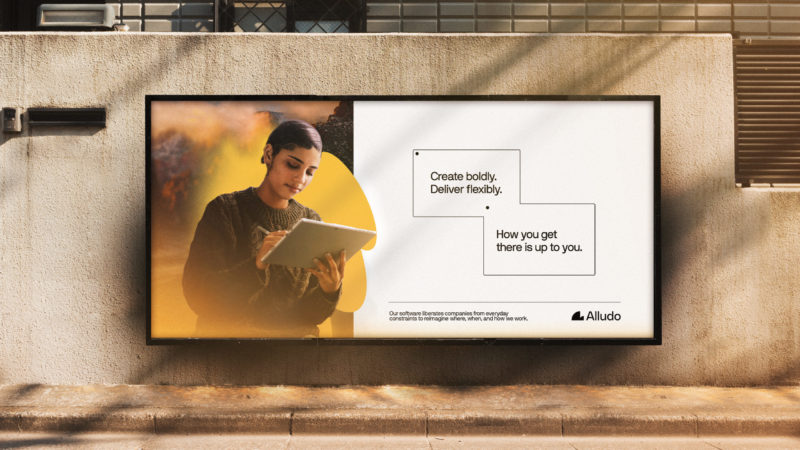
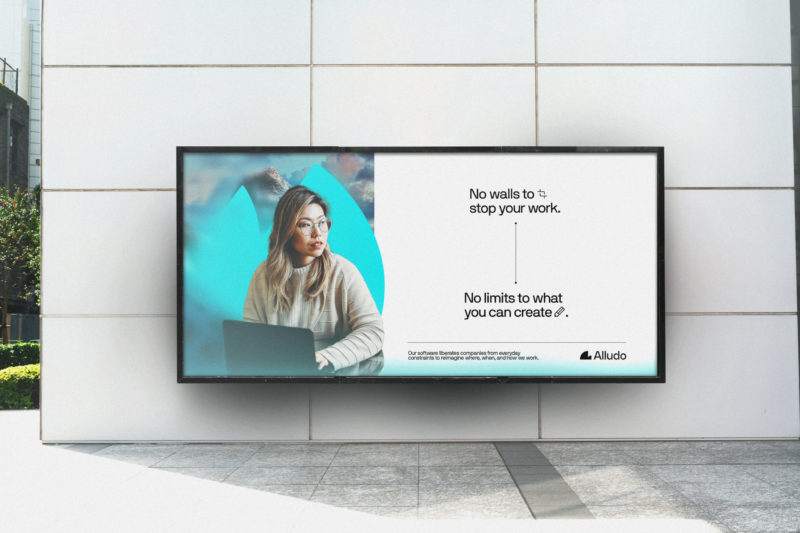
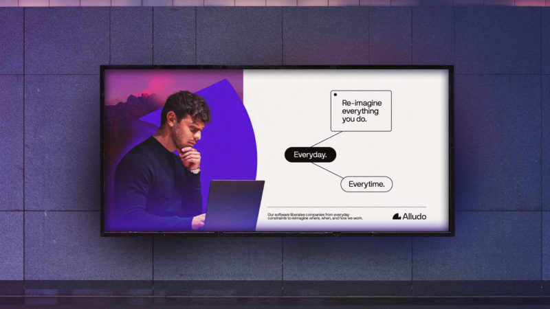
Our background layer allows us to add an element of magic showing how we support you to work as you want, where you want, when you want. And our unique shapes are used to represent different work modes. Like whether we’re in focus mode… or energized by collaboration, our system allows us to represent everyone’s different working styles, while also creating consistency across the times of day and other brand elements, like our logo symbol.
Tone of voice
Our tone of voice is aspirational, uncomplicated, and empowering—and with those elements, it reflects the brand promise we make for our audiences. It’s aspirational because we show up with an unrestrained spirit, alive with ingenuity. It’s uncomplicated, because we declutter your space and time—giving more space for work and time for ideas. It’s empowering, because we enable more moments of genius.
Logo
When creating a logo, we needed to ensure that there is shared DNA between the creative toolkit we use to bring the brand to life and the logo itself. There’s intentional cohesion between the wordmark, the symbol, our pillar brands, and our overall brand creative. Let’s break that down a bit.
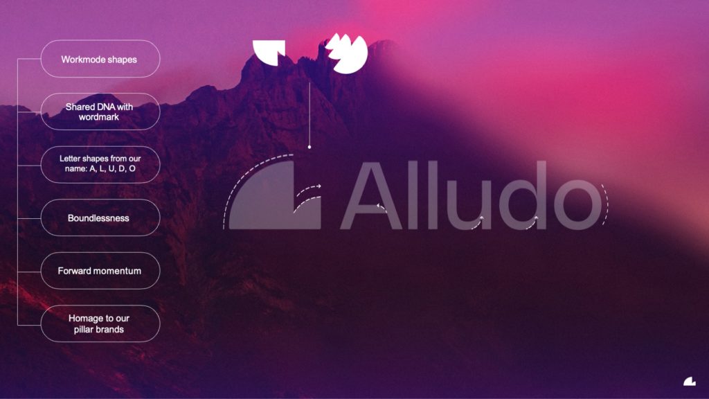
The symbol is derived from our brand “workmode” shapes. Throughout our brand expression, you’ll see shapes layered with images––a defining feature for us. The logo symbol evokes those shapes, creating another connective point between the visual elements.
It also has shared DNA with our wordmark. The wordmark shares the same curves and negative spaces with the symbol, creating a sense of harmony and an instant brand connection. The symbol’s shape and negative space hint at the letters A, L, D, and O—a clear nod to our name, Alludo.
We could have oriented our symbol in any direction, but the way it’s placed is intended to evoke forward momentum and movement, playing into the boundlessness we’re infusing throughout the brand. Think a ball bouncing, a wave cresting, or a sun rising on the horizon.
As if we hadn’t packed in enough meaning, the new logo shape also pays tribute to our pillar brands, as shown in the image below. We can see similar shapes and angles across our platform of products, which is an important element of creating a cohesive brand.
Our wordmark is bold but uncomplicated—just like our tone of voice—and that’s exactly what we were seeking with our symbol, too.
When our logo appears in videos, you might notice a sound that goes along with it. That’s our sonic identity. That’s a sound that’s specific to the brand, and it’s something that many major brands—like McDonald’s and Netflix—have. A sonic identity is way to make the brand a more thoroughly multisensory experience, and we’re thrilled to have one for Alludo.
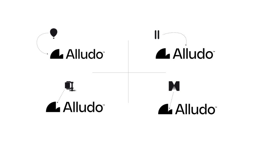
Finally, our logo represents so much of what we’re trying to do with this new brand—to reimagine the future of work. When we asked employees to provide an initial reaction to the symbol, responses included times of day with a sunrise or sunset horizon; mountains, such as the Yosemite half dome; and beautiful architecture like the Sydney Opera House. This representation of possibility and stretching of space and time—it’s exactly what we want Alludo to evoke.
One other really wonderful observation that we saw time and time again in the responses to our symbol was the idea of something smaller becoming part of something bigger, or the relationship between parent and child. That’s exactly what Alludo is—it’s the parent brand that helps carry our purpose and our message forward to strengthen our pillar brands and embrace the culture we’re building here, together. It leaves space for growth in new areas, while creating a cohesive structure, story, and roadmap for our business to build towards. Or, put another way, it gives us space for work and time for ideas. How fitting.
Employee engagement
We planned for employee engagement before we seriously considered external engagement. Having been through many a rebrand, I can tell you that having employees onboard is fundamental to the success of your brand. We spent six weeks immersing our employees in activities to help them understand all the nuances of our brand and what it stood for before we ever told the outside world. By launch day, our employees already knew Alludo and were excited to help us tell the world.
I’ll write another blog in the future about our engagement activities because they were really truly special, and over 70% of our employees participated. (I’ll be honest, I was surprised by just how engaged the employees were! So engaged, we kept adding new activities.)
And the process is still ongoing. While we already held our brand launch, this isn’t a “set it and forget it” task. It’s a journey, and one that we’ll continue to evolve and refine as we go. I’m so excited for you to experience our new brand in full effect. I’m grateful to the many people who made this possible and I’m thankful to you for reading this, and for all you do.